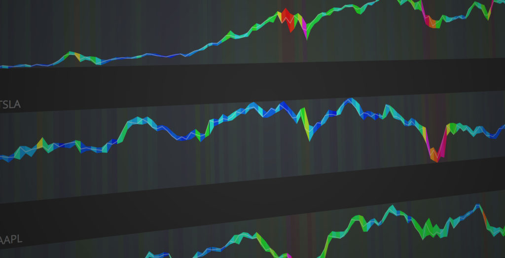
Stocks
Yes I know. Stock charts are about as played out as it gets, but hey… I love data, and I love visualizing it. A little searching will turn up way more data than you’ve ever dreamed of. I’ve created several different charts, that have helped me lose my money very effectively, but my favorite has to be the volume color chart. I haven’t seen this anywhere else, and it turned out pretty cool.
Each segment(day) of the chart is colored based on the volume of trades within that time period. The colors are converted to an RGB value along the BLUE to Magenta color spectrum.
The data is provided by the IEX Trading API.

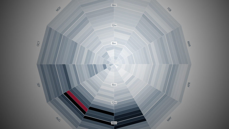
30 Years of Rain
The initial reason for this viz was to help me decide when to schedule soccer tournaments. Summer time soccer leagues are constantly plagued with “rain-outs” and wet field conditions that just plain suck. We deal with it, because we are Floridians, but I was determined to find a hidden time-slot that would make everything better… and I did. If we start games at 4am and end before about 8, we will have much better chances of no-rain… Just kidding.
This visualization pretty much just states the obvious, which is fine because it looks pretty cool.
BTW, the darker colors mean higher probability of rainfall, and the red is the highest probability of rainfall.
The visualization is based on 30 years of data from the DarkSky Forecast API
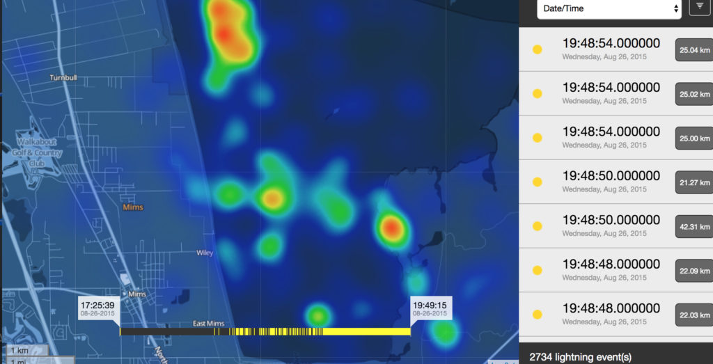
Precision Lightning Surveillance
Since I started doing web-based data visualization (2010-ish), I’ve always enjoyed the added dimension of geography. There is so much that can be layered on a map and it almost always looks incredible.
This particular project is cool, because it displays lightning strikes. The strikes are detectd by a customer’s lightning Surveillance System (my company sells these), and the relevant data are automatically uploaded to a web server. If the strike location is within a predetermined geofence, the customer receives a tex and email alert. The display can be set to a live view that will update anytime a new event is added to the database, or a historical mode for analysis after-the-fact.
I designed and coded the entire web application. (Database to UI)
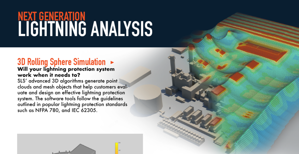

Lightning Protection Visualization
Lightning Protection Design is managed by several lightning protection standards. These standards drive the design process and predict the overall safety of a system. Our company specializes in advanced lightning protection. We analyze a customer’s facility or structure and provide a report. The visualizations in the report are products of a script that I wrote, that will visualize a 3D Zone of protection mesh. In addition to the mesh, my script also visualizes the results of 100,000 year monte carlo simulation of the structure.


Dribbble Top Shots
Dribble is awesome. I’ve always been facinated by the amazing talent that’s out there, all over the world. I check it pretty regularly and I began to get curious about how shots would make it to the coveted top spot. I found that they had an open API, so I went to work.
The visualization shows a square for each shot in the top 12. The color of the square is the average color of the shot. By showing the top 12 every hour (each column), it creates a cool mosaic, with a few of them trending upward.
It’s interesting to see how long some of the shots spend in the top spot.
The product was live for years, but when dribbble introduced their API 2.0, it broke. I found some limitations with the new API, but would like to work on a work-around someday.
Comments are closed.